
Intro
Project Background
About MASCO
The navigation structure included “Market Trends” and “Products” as major sections. However, the “Market Trends” section only covered four solution groups, failing to provide a clear representation of the complete product portfolio. Meanwhile, the “Products” section intended to list only products but included a mix of products and solutions, leading to confusion. Additionally, the use of internal-facing terminology for product groups and portfolio names was not user-friendly, making it difficult for external users to understand. Furthermore, repetitive information was presented under the same group, creating unnecessary redundancy and overwhelming users.
My Role
I independently led the User Experience (UX) and User Interface (UI) design efforts for the project from start to finish, ensuring a cohesive and user-centered approach throughout. Collaborating closely with cross-functional teams—including engineering, product management, graphic designers, and the brand manager—I ensured that all criteria and requirements were met while maintaining alignment with the brand’s identity and objectives.
I played a pivotal role in driving the design process, guiding key meetings such as project kickoffs, workflow discussions, and stakeholder presentations. My responsibilities encompassed the entire lifecycle of the project, from conceptual ideation and information architecture to prototyping and final deliverables.
In addition to facilitating collaboration across teams, I ensured a smooth and transparent design process by aligning stakeholder expectations and incorporating feedback at every stage. This hands-on, strategic approach resulted in a product that not only met technical and business requirements but also provided a seamless, intuitive experience for end users.
Goal
The retired Caldera Spas control panels featured button-based interfaces developed exclusively by engineers, with little to no involvement from UX designers. As a result, the design lacked user-centered considerations, leading to inefficiencies and challenges for users navigating the system. The software skeleton from the previous version was carried over to the updated control panel, serving as the foundation for a significant redesign.
The primary goals of the update were to address these limitations by reorganizing the information architecture to enhance clarity and accessibility, redesigning the user flow to ensure a seamless and intuitive experience, and modernizing the interface to align with contemporary usability standards and aesthetic expectations. This comprehensive approach aimed to deliver a control panel that prioritized user needs, providing a more engaging, efficient, and satisfying interaction for all spa users.
Reframing the Problem
The most challenging aspect in the initial stages was integrating proposals from engineering. The original proposal relied heavily on the previous software’s structure, which included discontinued or incomplete user flows. While engineering focused on the technical logic behind the spa's operation, the proposal lacked a user-centered approach, overlooking how customers would actually interact with the system.
To address this, I first needed to fully understand the technical logic behind the engineering proposal. Next, I examined the spa's functionality and how users typically interacted with the touch screen interface. I then gathered valuable feedback from customer service teams and other stakeholders who had firsthand experience with the previous interface. Finally, I synthesized this feedback from multiple perspectives to identify key UX gaps, allowing me to design a more intuitive and seamless user flow that better met both technical and user needs.
UI/UX Problems Identified
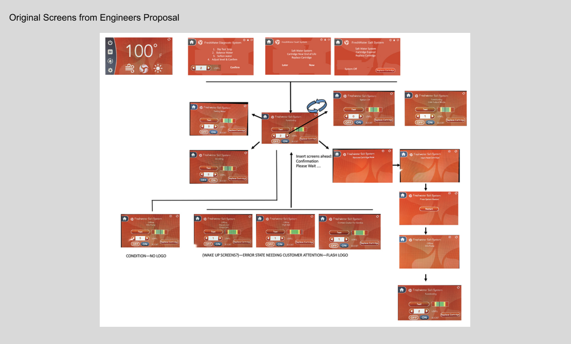
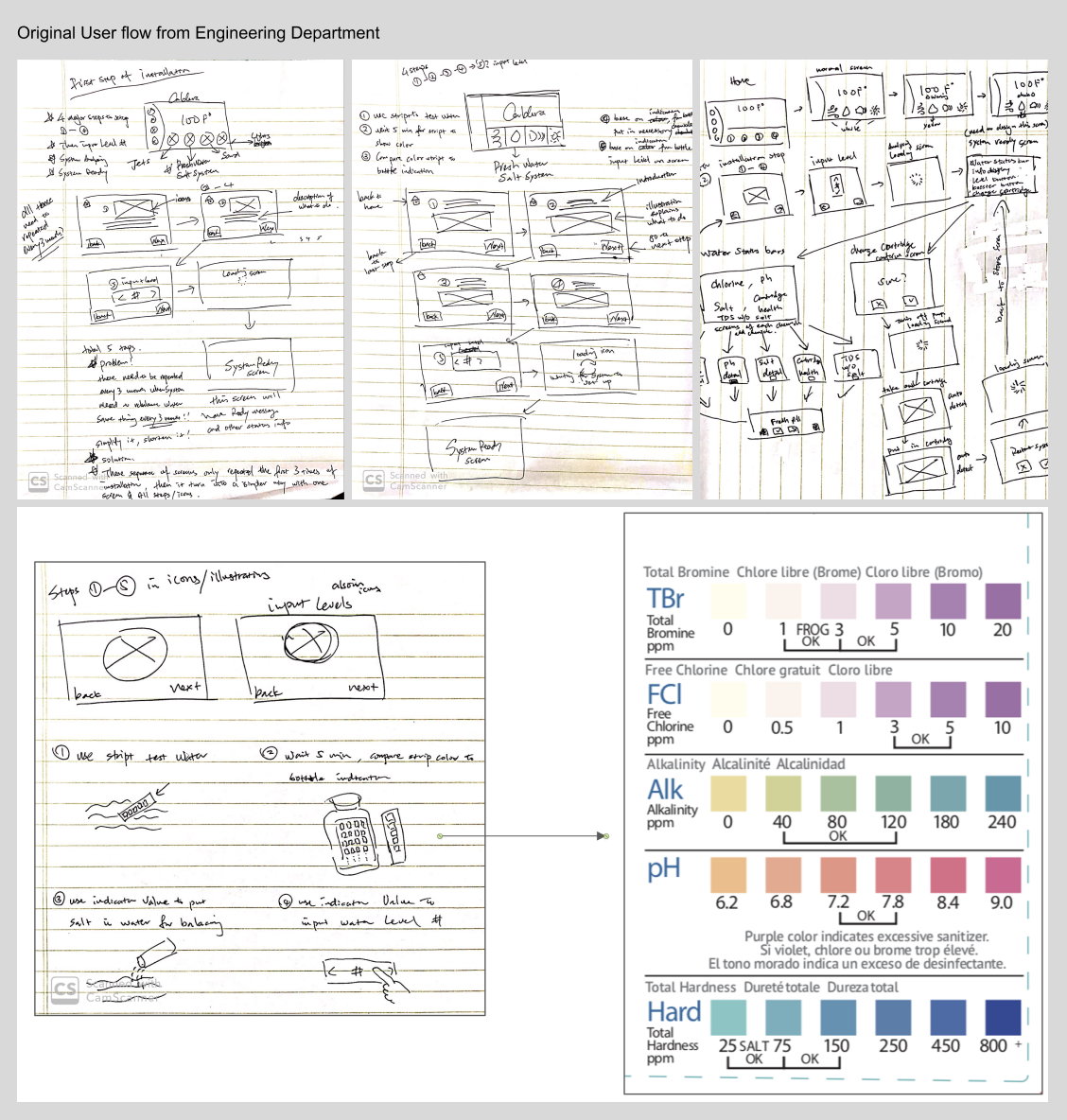
This was the first flow chart I received from the engineering team, which served as the starting point for the redesign. Upon reviewing it from a UX perspective, several significant issues became apparent, all of which needed to be addressed to ensure a more intuitive and user-friendly experience.
1. Legibility Issue: Red Screen: The red background created a strong contrast with the text, making it difficult to read and causing potential strain for users, particularly in low-light environments.
2. Confusing Instructions: The instructions provided were unclear and overly complex, leading to potential user confusion and frustration when attempting to navigate through the system.
3. Outdated UI Elements: The interface featured outdated design elements that felt disconnected from modern design standards, negatively impacting both usability and visual appeal.
4. Discontinued User Flow: The user flow was fragmented and inconsistent, with several steps missing or disconnected, leading to potential user errors or the need for unnecessary workarounds.
5. Aesthetic Issues: The overall design lacked a cohesive visual language, resulting in an unappealing interface that didn’t align with the brand’s modern aesthetic or user expectations.
6. Confusing User Path: The navigation path was unclear, making it difficult for users to understand what actions to take next, leading to frustration and inefficiency in completing tasks.
7. Set-Up Instructions Flow: The flow for setting up the spa system was especially challenging, as users were not guided through the process in a clear, logical sequence, leaving them unsure of next steps.
These issues, combined, contributed to a frustrating user experience that failed to prioritize usability or user needs. In response, my focus shifted to addressing these concerns by streamlining the user flow, updating the interface with modern, accessible design elements, and ensuring that all instructions were clear and actionable. By improving both the functionality and aesthetics, I aimed to create an interface that not only met technical requirements but also delivered a seamless and enjoyable experience for users.
Hardware Constrains
1. Screen Size: The UI had to be carefully designed to fit within a compact 270x480 pixel screen size. This required prioritizing essential information and interactions while ensuring optimal usability and readability within the limited real estate.
2. Stakeholder Assumptions: The original red-screen interface was developed by chemical engineers with 15-20 years of experience at the company. While their expertise in water testing and balancing was unparalleled, they held deep-rooted assumptions about the ease of these processes for end-users. They believed that setting up the Salt System and balancing water was intuitive for everyone, which overlooked the varying levels of user familiarity and technical comfort. Addressing these assumptions required a user-centered design approach to make the system more accessible to all spa users.
3. Operating System Limitations: The proprietary operating system imposed significant constraints on the design, including limited color palettes, low resolution, and strict graphic requirements (18-bit/24-bit). All UI elements had to undergo meticulous technical treatment before placement in prototypes. Incorrectly processed graphics resulted in visual artifacts, such as a magenta border, requiring extra attention to detail in the asset preparation phase.
4. Touch Screen Sensitivity: The touch screen presented unique challenges due to its design, featuring double-layered protective films to safeguard against water and chemicals. This significantly reduced sensitivity, demanding larger and more responsive touch targets to ensure smooth interactions, even under suboptimal conditions.
5. Language Localization: The interface text required translation into 20 different languages, creating potential real estate issues due to varying text lengths for body copy. Accommodating these differences without compromising layout consistency or usability was a critical design consideration, requiring flexible layouts and scalable text containers.
Each of these challenges demanded innovative solutions and a collaborative approach to balance technical constraints, stakeholder expectations, and user needs. The resulting design prioritized usability, accessibility, and adaptability, delivering a polished experience despite significant limitations.
Redefining Information Architecture
Overcoming Hardware Constraints
The redesign process began with a comprehensive reorganization of information and screen architecture. This involved rethinking and restructuring the user flow to create a more intuitive and seamless interaction experience. A new user experience proposal was developed, focusing on optimizing navigation, minimizing complexity, and aligning with user needs and expectations.
Collaboration was a critical component of this process. I worked closely with hardware and software engineering teams to address technical challenges and constraints while ensuring that design goals remained achievable. These discussions highlighted key limitations, such as the compact screen size—measuring only three by four inches—and the use of 8-bit technology, which significantly restricted the system’s ability to render high-quality graphic elements.
To address these constraints, I created initial sketches, wireframes, and interactive prototypes, refining them through multiple iterations with feedback loops involving product managers, engineers, and the CEO. Each iteration focused on balancing usability, aesthetics, and technical feasibility within the system's limitations.
The restricted hardware capabilities demanded innovative design solutions, such as prioritizing clear typography, simplified visuals, and a streamlined layout that maximized the use of available screen real estate. By embracing these constraints as opportunities for creative problem-solving, the final design achieved a user-friendly and visually cohesive interface that elevated the overall experience while adhering to technical requirements.
Research with Chemical Engineers
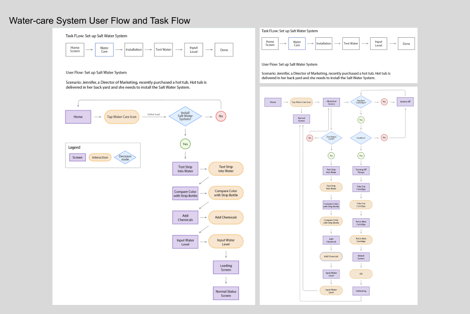
Understanding the correct procedure for setting up the Salt Water System is crucial to ensure successful spa operation. If users skip any steps or misinterpret the chemical levels, they must drain the spa, remove the incorrect chemicals, refill it with fresh water, and restart the entire setup process.
This mistake comes with significant costs for spa owners, as it wastes water and chemicals and delays the proper functioning of the spa. Additionally, improper chemical balance can lead to skin irritation and health issues for users. These setbacks can cause user frustration, negatively impacting the overall experience and leading to poor product reviews. Furthermore, recurring issues with setup errors could damage the brand’s reputation and present potential liability risks for the company, making it a serious business concern.
Ensuring that users follow the correct procedure is therefore not only a matter of operational efficiency but also essential for maintaining customer satisfaction, safety, and brand integrity.
Identifying and Addressing User Pain Points
To improve the user experience, I conducted extensive research by gathering online reviews, collaborating with the customer service team to uncover recurring user pain points, and interviewing users who had tested the legacy system. This feedback-driven approach was crucial in identifying key issues and informing the redesign process.
One user of the legacy system provided feedback:"Please change the red background, my eyes hurt. I don’t care if this was the executives’ decision, but red is just horrible."
In response to this feedback, I revised the background color to a more neutral tone that aligned with brand colors. The initial draft featured a taupe background, which was later updated to charcoal to enhance contrast and overall readability.
Another user commented: "I can’t even see some words/icons; sometimes it’s hard to read the information on screen. If I stared at the screen for too long, things started to get blurry and harder to read."
This highlighted significant readability issues, including the use of fonts smaller than 10pt in the legacy system. To address this, I increased contrast and adjusted font sizes to improve legibility and user comfort.
This informal research process was initiated when I happened to meet one of the legacy system testers after a meeting with the engineering team. He approached me and expressed his frustrations with the legacy system, sharing where he felt stuck, which elements were difficult to locate, and what information was missing. These insights were invaluable. I documented all of his feedback and created a questionnaire to distribute internally to gather additional perspectives from other users.
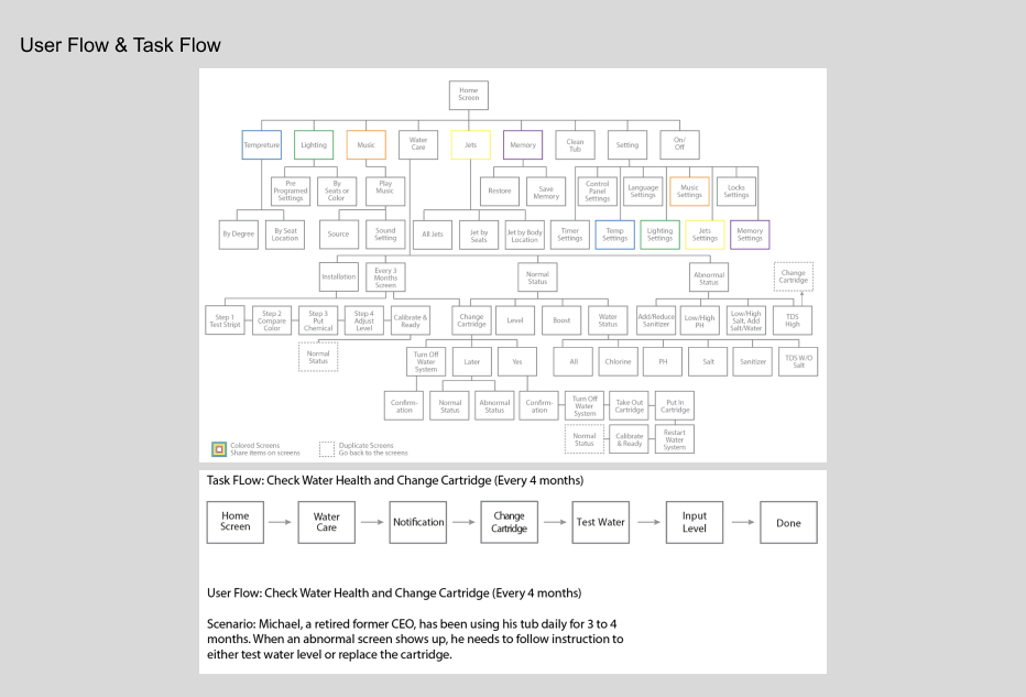
By aggregating these insights, I was able to identify critical pain points and use the data to refine both user and task flows, ensuring the new system would be more intuitive, functional, and accessible. This approach not only addressed immediate usability issues but also set a foundation for a more user-centered design moving forward.
Refining UI Alignment
One of the major challenges during the project was addressing UI alignment and resolution issues, which were particularly complex given the limitations of the screen’s size and technology. Collaborating closely with the engineering team, I spent considerable time exploring and testing solutions tailored to the unique specifications of the hardware. This iterative process ensured that the interface not only looked polished but also functioned seamlessly within the system’s technical constraints.
To validate the design, I conducted an internal user testing phase, gathering valuable feedback from stakeholders and cross-functional teams. Minor adjustments were made based on these insights to fine-tune the interface and enhance usability before the system was finalized for launch.
This project served as a comprehensive learning experience, where I managed every aspect of the process—from initial problem-solving and collaboration with multiple departments to refining workflows and ensuring alignment across teams. The redesigned control panel was met with overwhelmingly positive feedback from stakeholders and the executive team, highlighting its success as a user-centered, technically sound, and visually cohesive solution. This outcome reinforced the value of thoughtful UX design and effective cross-departmental collaboration in achieving impactful results.
Enhancing Usability Through
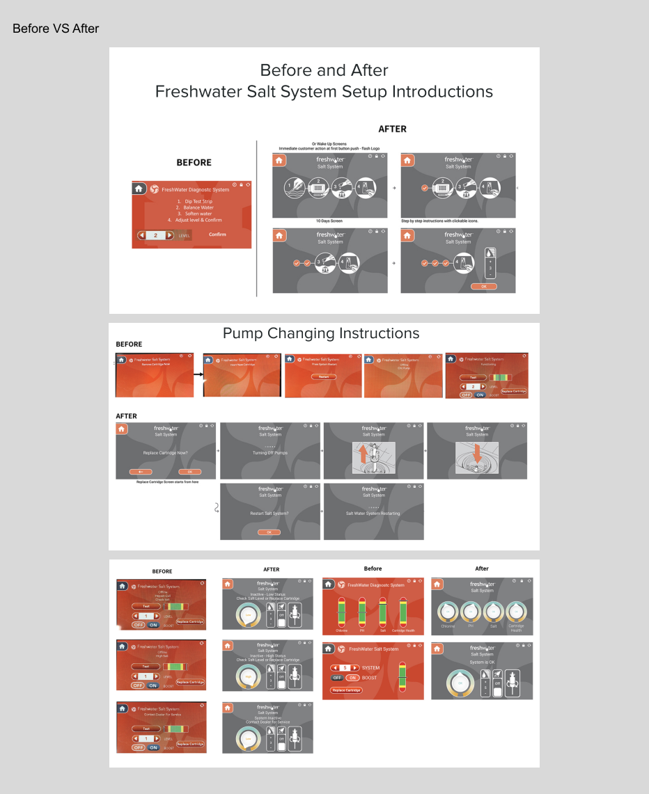
The original screen color posed a significant usability issue, as it was an orange-red hue that even testing engineers found difficult to read. This low legibility not only created strain for users but also undermined the overall user experience. The solution was straightforward: transitioning to a dark, neutral color that reduces saturation and increases contrast with on-screen content. To ensure consistency and reinforce brand identity, the updated color palette was carefully selected from the brand's official colors, balancing aesthetics with functionality.
The original setup instructions also presented a major challenge, offering only four vague bullet points paired with confusing button controls for adjustments. This lack of clarity frustrated users, particularly first-time spa owners, and frequently led to setup errors. To address this, a step-by-step introduction mode was designed, featuring clear instructions and illustrative displays to guide users through the setup process seamlessly. This mode automatically initiates during the first use, ensuring system synchronization is completed correctly. To enhance flexibility, the introduction mode can be skipped upon subsequent uses and reactivated at any time via a shortcut on the home screen, accommodating both new and experienced users. This approach prioritizes user empowerment, reduces errors, and significantly improves the overall setup experience.
Feedback & Challenges
Users feedback
The initial feedback from both engineering and users highlighted the need to address the screen color, which posed significant usability and accessibility issues. However, through user research and analysis, I identified a more critical problem before receiving feedback from the CEO: the setup instructions for the FreshWater Salt System. This issue not only led to poor customer satisfaction ratings but also had a direct impact on the business, resulting in financial losses.
Properly setting up the FreshWater Salt System is crucial, as an incorrect setup requires users to drain and refill the entire spa, creating frustration and additional effort. The existing setup instructions were overly complex and unclear, leaving many customers unable to complete the process successfully. This confusion not only diminished the user experience but also forced the company to incur significant costs by dispatching professionals to customers’ homes to resolve setup issues. Addressing this pain point became a priority to improve usability, enhance customer satisfaction, and reduce operational inefficiencies.
Visual Challenges
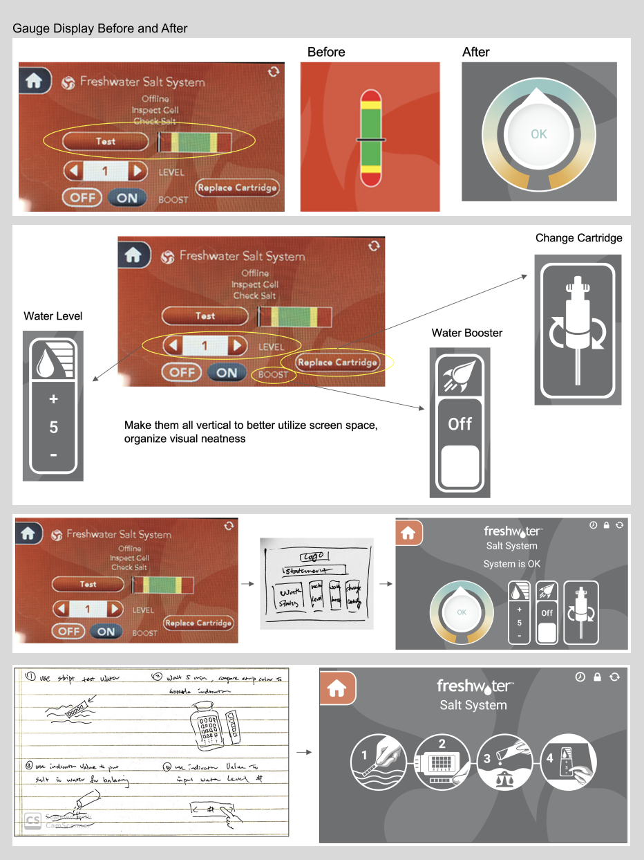
In addition to the outdated look and feel of the interface, the water level status bar utilized standard red, yellow, and green colors to represent its status. While this approach was functional and universally understood, it lacked visual sophistication and failed to align with the modern, premium aesthetic expected from a Caldera Spa product. Updating the status bar with a more refined and brand-aligned color palette not only improved its visual appeal but also enhanced the overall cohesion of the interface design.
A more pressing issue, however, was the random placement of screen elements, which lacked logical organization and disrupted the user flow. This disorganized layout made it difficult for users to locate key information or complete tasks efficiently, leading to unnecessary frustration. Addressing this required a systematic approach to redesigning the screen’s information architecture. By prioritizing a logical and intuitive layout, grouping related elements together, and introducing a clear visual hierarchy, the redesigned interface provided users with a seamless and effortless interaction experience, aligning functionality with aesthetics for a superior overall design.
Solutions
To enhance the user experience and optimize the functionality of the control panel, several key changes were implemented:
1. Integrating the Testing Button and Status Bar:The testing button was combined with the status bar to streamline functionality and create a more cohesive interaction point for users. The updated design includes a modern water health status display that provides real-time feedback in a visually appealing and easy-to-understand format.
2. Updating the Color Palette:The original red, yellow, and green status indicators were replaced with a teal and yellow color scheme. This update not only better represents water health but also aligns more closely with the brand’s visual identity, creating a more polished and harmonious aesthetic.
3. Optimizing Button Orientation: Traditional horizontal buttons were replaced with vertical buttons to make better use of the limited screen real estate. This orientation allows for a cleaner layout, ensuring that key controls remain accessible and visually balanced within the compact interface.
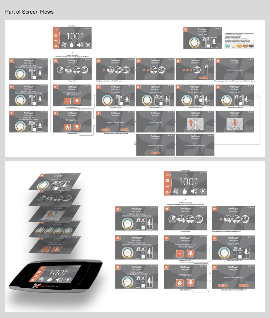
4. Establishing a Consistent Layout: A unified and consistent layout was applied across all screens to enhance usability and reduce cognitive load. This consistency helps users navigate the interface with confidence, as familiar patterns and design elements are maintained throughout the system, minimizing confusion and improving the overall interaction experience.
These refinements reflect a user-centered approach, prioritizing clarity, functionality, and aesthetics to deliver a seamless and intuitive experience that aligns with the brand's commitment to quality and innovation.
Clarity and Consistency
Legacy System: The Water Status Bar in the legacy system presented inconsistencies in its UI design. It featured two different versions—a capsule-style and a rectangular version—which created confusion for users. Additionally, the functionality was represented by a button that users could tap to access detailed status information, but this design lacked clarity and uniformity.
Current System: In the redesigned system, the Water Status Bar has been streamlined to feature a gauge display that visually represents the chemical levels from low (left) to high (right). Simple English terms such as "low," "ok," or "high" are displayed in the center, making the status easily understood and adaptable for translation into 10 other languages. The central part of the gauge functions as a tappable button, providing users with easy access to detailed information.
The color scheme has been updated to better align with the brand’s style while also improving the clarity of the water status indicators. The updated design not only enhances aesthetic appeal but also provides a more intuitive and consistent user experience, ensuring users can quickly assess and understand their spa’s water health.
End Result
The redesign of the Spa Control Panel system was a highly successful project that received widespread positive feedback from both internal stakeholders and actual spa users. Through extensive user research and feedback, we identified critical pain points in the legacy system, including inconsistent UI elements, poor readability, and an unintuitive flow. The redesigned system streamlined the Water Status Bar, replacing the old, inconsistent visual elements with a clear, color-coded gauge that was easy to understand and visually aligned with the brand. Key features, such as a tappable button for detailed status information, were integrated seamlessly into the design to improve functionality and accessibility. Additionally, the system was optimized for multi-language support, ensuring that users worldwide could easily navigate the interface. The new design not only enhanced the user experience by providing a more intuitive, consistent, and aesthetically pleasing interface but also addressed user concerns, resulting in a significant increase in user satisfaction and positive customer survey responses. This successful redesign effectively improved the overall usability of the spa system, fostering greater customer loyalty and satisfaction.
Other Projects
Use below links to explore Iris' other product design projects


